- Працевлаштування студентів
- Практики та стажування
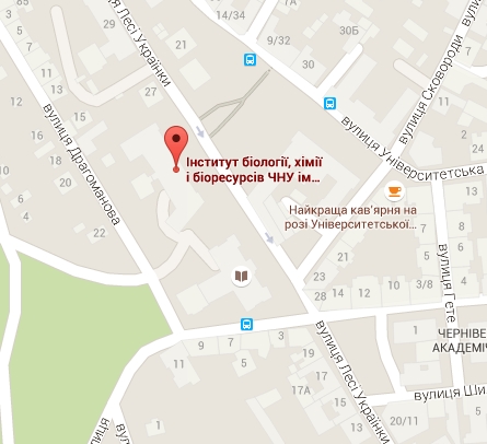
- Інновації, розробки та патенти
- Розробка програм навчання
- Консалтингові послуги
- Компанії-партнери
- Актуальні потреби
- Події та заходи для бізнесу
- Меценатам та філантропам


Способи представлення графічної інформації
R is a free software environment for statistical computing and graphics. It is the most widely used language for data science, together with python.
R is also a great tool for data visualization. The native tool becomes even better thanks to external packages such as ggplot2 that are widely used in the gallery.
If you're wondering what you can do with R in terms of dataviz, visit the all charts page.
The R graph gallery displays about 400 charts, always providing the reproducible code and explanations. Charts are organized by family and types.
For each chart, a focus is made on code, but a link toward data-to-viz is provided to give more information concerning the theory.
I always forget how to build a chart and thus decided to build this gallery as a personnal cheat-sheet. I hope it can benefit others, but please keep in mind I maintain it as a side project.
https://www.r-graph-gallery.com
А натиснувши на графіку можна дізнатись як правильно групувати і яким чином представляти наукові дані
![]()
Вагові коефіцієнти за результати національного мультипредметного тесту (НМТ)
Спеціальність - 201 Агрономія
1. Українська мова - 0,4
2. Математика - 0,3
3. Історія України - 0,3
4. Мотиваційний лист
Лише контракт - Мотиваційний лист


- Рекомендації, щодо підготовки файлів до подачі на перевірку в системі аналізу на текстові запозичення (UNICHECK).
- Теми магістерських робіт
- Теми бакалаврських робіт
- Графік консультацій
- Графік роботи навчально-допоміжного персоналу кафедри
- Графік контролю успішності студентів
- Графік взаємовідвідування занять викладачами
- Розклад сесії
Підготовка до ЕК- Критерії оцінюванння студентів на ЕК
- Графік роботи ЕК (+ посилання на Meet Google)
|
All |
from 2015 | |
|---|---|---|
| Citations | 704 | 301 |
| h-index | 11 | 7 |
| i10-index | 15 | 5 |